Today I encountered a plotting problem and learned a new small trick, so I’ll record it here.
ggplot provides many commonly used plotting functions that are very convenient, and the plots can be drawn with various groupings. However, sometimes I have some special requirements that ggplot cannot satisfy, so I need to perform some operations manually.
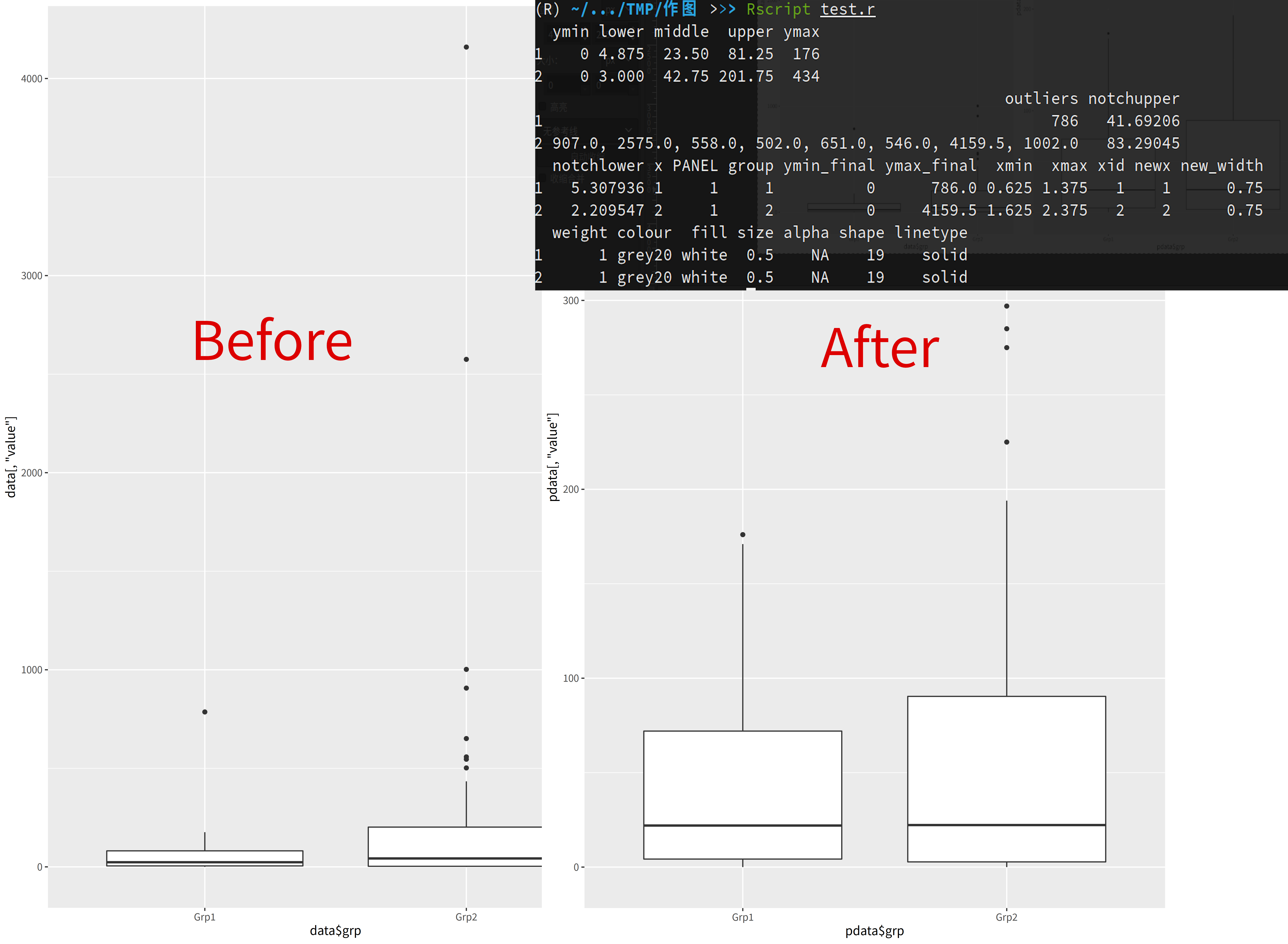
For example, today I needed to draw a grouped boxplot where each group has its own outliers. These outliers would make the plot crowded on one side, making it difficult to observe, so they need to be removed. Although geom_boxplot has parameters for outlier handling, unfortunately these parameters don’t actually remove the outlier points from the data - they just don’t display them on the plot. This means the plot remains crowded in the same way, failing to achieve the desired effect.
The most common solution I found online is to use the $out content from the built-in boxplot function to extract outlier values and remove them. Unfortunately, this method doesn’t seem to provide grouped outlier results - it gives overall outliers instead. If you need to remove outliers by group, you would have to manually split the dataset and process each group individually.
Is there a lazier way?
I actually discovered one…
Just like built-in functions, ggplot’s plots can extract the actual plotting data:
1 | plot <- ggplot(data=data,mapping=aes(x=data$label, y=data[,tag])) + |
The layer_data function is one way to extract the data (using build_plot(plot)$data has the same effect).
plot_data stores all the data that ggplot uses for plotting. The part we need is stored in the outliers column, and it’s arranged in the same order as shown on the plot. Therefore, as long as we manually specify the factor levels for grouping during the initial plotting, we can get the outliers for specific groups directly from the plot.
Then, utilizing ggplot’s automatic handling of NA values, we can replace the outlier values in the corresponding column with NA, creating a dataset without outliers. Then, we can redraw the plot to solve the problem!
Complete plotting code and plot comparison:
1 | library('ggplot2') |


